Drafts
I drew a couple of drafts to have an understanding to what i was going to produce for my magazine. It took took three stages to develop and i had to think about the conventions of the magazine and it had to link back to my film trailer. I thought about every step adding different elements that could to a conventional magazine cover and what the audience would expect to see in a action magazine.
This is the first stage of the development processes, as you can see i have a basic layout of an idea and i all i must do is expand my ideas
This is the seconded draft as you can see it has been developed alot more than the first. It has to be tweaked a bit more so it looks like a real magazine cover, such as the spine of the magazine and make sure im using the right image for the front cover, the font is right and the whole concept.
Here is the final Draft and what it should look like in the end. I have put a spine on the side so it gives that proffesinal look and feel and it will attract audiences by the concept of the film, as magazines have to be exciting in order for the public to buy it and read. The barb wire wrapped round the text and the main image gives the magazine a hard look witch is reception theory giving the audience what they need and should expect from a action film magazine.
Step 1
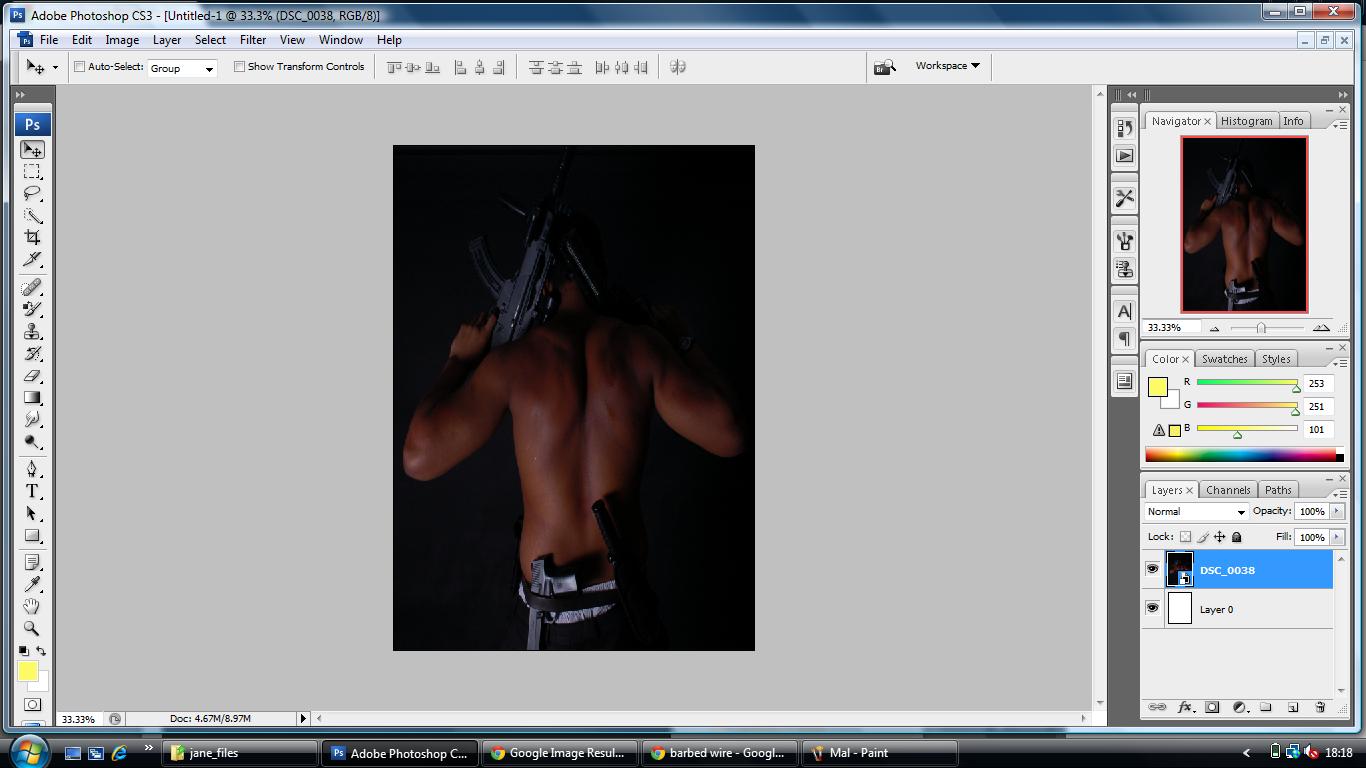
First i took the shoots that Charlie & I took and placed it in Photo shop of Frank 'David'. I used this image as it represented our film alot by the use of the pose, guns and stature of the image. It is conventional and this is what an audience would expect from a action movie, which ties in with the reception theory and mode of address.
Step 2
The next step i performed was adding barb wire for a background. I used this idea as it was conventional to the magazine and goes with the genre I'm basing it on which is the action category. The barb wire represents the strength of the magazine and adds a very conventional feel.
Step 3
I then added light exposure and Brightness and Contrasts on Davids back to give that Hollywood professional photography look. I then added Text and placed it behind David and automated the colour to red and added an outer glow which was yellow, i decided to keep that colour primary to the whole magazine so it all matched up and did not look untidy. I also Wrapped the barb wire around David to give it that 3D effect and that will attract the audience ans its something exciting and different.
Step 4
I Then added a sub heading titled 'The Ultimate Exclusive' and i kept that Yellow as it stood out and I'm keeping the colour code the consistent through out.
Then i went on the Internet and found an image of a bullet and the wind coming off it, i photoshoped it and put at the the bottom of my magazine. It was black at first but i decided to change the bullet red and the wind yellow to keep the colour coordination consistent. I then added text on the bullet and put Synergy, my magazine title. Then i started putting in behind the scene pictures of the film as i was showing an exclusive insight to the film, but after talking to my teacher i will change it to shots of the film.
Step 5
The next step was to create the Pelican Hunter Logo, and it had to be a font that would be consistent through out our film and throughout my other team mates magazines. I then had an idea to wrap the barb wire around the text which would give it that gritty action feel and still keep it 3D and conventional. I did not really like the position it was in so i changed it.
Step 6
Here is the changed version here you can see the barb wire has tightened up and looks more 3 dimensional, the position has also changed slightly.
Step 7
I added the rest of the pictures and did the bullet effect in reverse so it created a border for my pictures.
Step 8
I Then added the small details a magazine needs, even though i need to change a few things around here is a basic idea of what i have produced.
Step 9
I then tried different types of ways of presenting it but in the end i stuck with the original sub heading 'The worlds greatest movie magazine'
Step 10
Then i added the information about what was going to feature in the magazine. I kept the colour so it matched up. One thing i need to do is to tighten it up so it is all equal and use the guide lines to help me.
Step 11
The last Thing to do was to add a bar code, which is too large and i will reduce it down.
Here is the final Image/Magazine Cover. Though this is the final edit i added a margin/spine to make it look more professional and it refelcts a real magazine cover and is conventinal to magazines we see today. It is a also has a colour cordination so everything looks the same and not all over the place. I feel that the public would buy this type of magaizine as it has all the right features and conventions of a real magazine.
Created By Alexander Leigh ^_^





.jpg)


