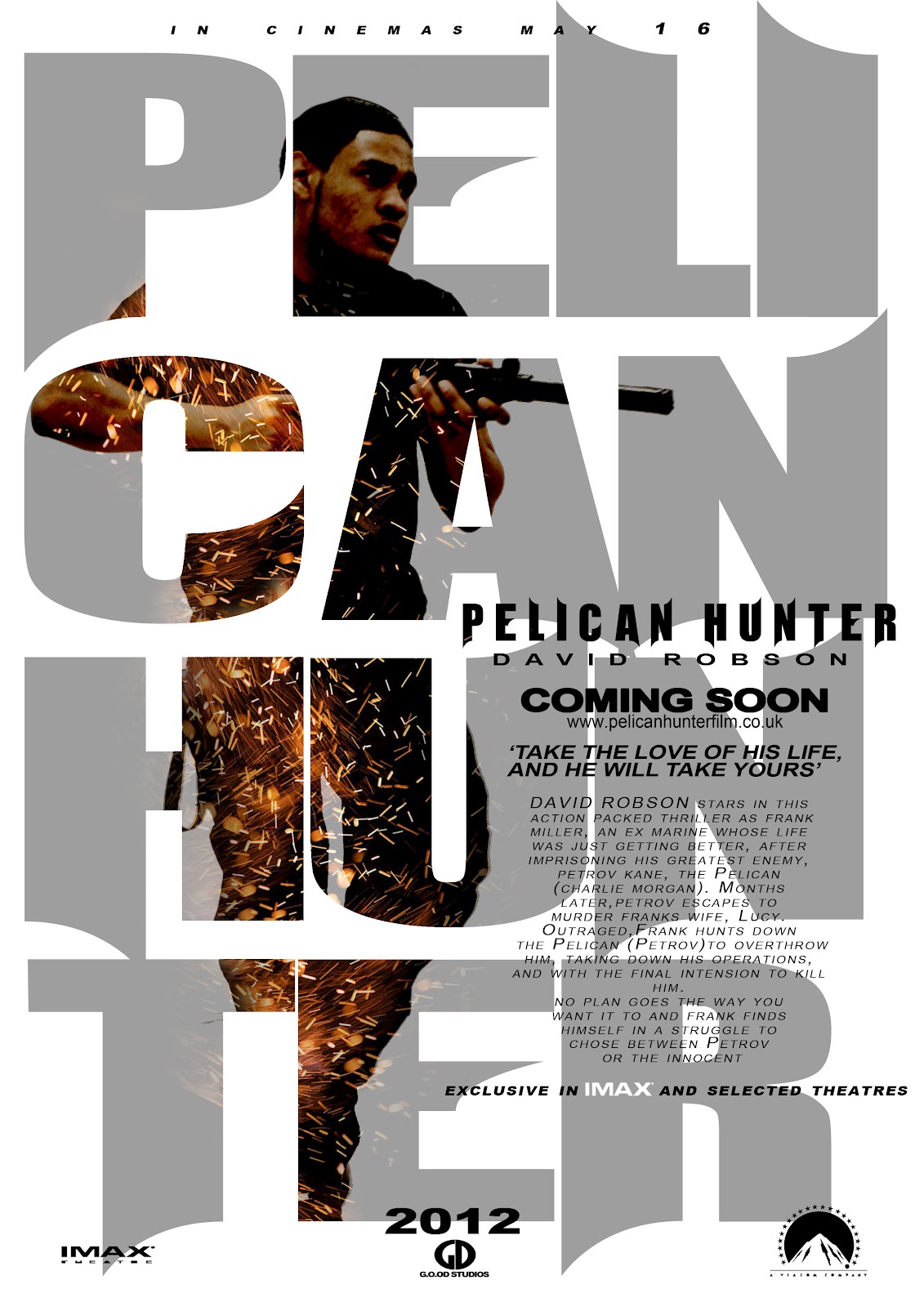
I wanted to maintain the text consistently so it linked between the different magazines and posters of my other piers of team G.O.O.D. The image we used in the poster was powerful and conventional to our genre as it has the bad vs the good guy on two separate posters, which many action movie posters do, when i researched in to real media products. The spark effect on both posters creates that gritty action feel to it and though the background is white the way we used the font on the poster made up for it and the way it was layed out was very smart. The small font with the credits also became generically conventional as you see it in all the film posters.
With the other Magazines the text was still same, as i said it had to be consistent.
The layout was different and it was a landscape so the image could fit for the shatter effect. The broken glass effect with the pelican hunter text was a smart idea and conventional to other real media products. The main task was to keep all the magazines and the posters in link with each other and i feel G.O.O.D have done so. The Pelican Hunter title was a 3D image and it links with the title in the film trailer at the end.
G.O.O.D also used all conventional motifs when producing and is shown in all all posters. We have looked into film poster and they all have the IMAX and the distributor 'Paramount, Universal, Warner Bros.' credits etc. The distribution is conventional as it is printed in all posters and on our print.
From this positive feed back i feel our film was presented and represented in the right way. The clear narrative came across to the audience and i feel the audience understood the concept of our film trailer. The reception theory came across as the audience knew the genre and understood the conventions of film trailer. The main importance that we wanted to get across was to keep the audience hooked on the trailer so they would not get board. G.O.O.D also wanted the audience to have a buzz after seeing the film and that came across through the feedback above.
G.O.O.D first produced a story board so it made it easier to know what we were going to film as all film's in the industry do. Our first draft that consisted of shots from London and Charlie's house, were all the difficult shots we wanted to get out of the way. We wanted feedback, so we showed the small clip to the class and our teachers in order to express their views upon our starting point. The feed back that was recognized most was the opacity of the film, it need to be brighter in the dark area's, the sound quality was very muffled and hard to understand and some of shots were to long. The mise-en-scene in particular was perfect for the convention purposes as G.O.O.D wanted it to be a gritty action London film.
Our first recognized mistake as stated earlier was the lengths of the shots. which is unconventional for a film trailer as they try to squeeze as much as possible. Our teacher noticed that It seemed we were producing a movie more than a trailer and we should no get carried away. The conventional genre adaption was there in terms of costume and the story but the main focus was making every shot snappy and quick.
We looked again into real media products such as the expendables, transporter (Video above) and mission impossible. Here you see the shots are quick and sharp with a few long enough shots which inspired us with new ideas by examining new codes and conventions of the action film trailer. The transporter 3 trailer shows the audience what needs to be shown in order for the audience to want to watch the full length film it in the cinema, which was our aim from the start.
In the Final trailer all the missing components and issues, picked up from the audience were all taken into consideration and had been thought through carefully in order for our genre to be consistent throughout and keep focus on our codes and conventions of a real action trailer. The opacity and length of the trailer had been changed so it was clearer to watch and the shots were consistently changing every 3-6 seconds apart form the odd few build up shots. The narrative was a lot more clear for the audience to understand the concept of the trailer. The fact that the shots kept changing with different locations and mise-en-scene helped drive that professional consistency to a real action convention of a film trailer.
Our final Video had many locations and and the mise-en-scene i feel was perfect for each shot and was conventional to the genre. Unlike music videos where they have location of either 5 different places, a film trailer has to be in many different locations, if not it defeats the purpose of a conventional film trailer. Our film trailer looked really realistic and showed similarities to real media film trailers as shown below. There was a lot of fight scenes now, different effects in the film (Frank zip lining down the shard) and characters in the film performed really well to the characters we created.
In recognition i wanted my ancillary tasks to show that it was conventional of the genre and product. I used Adobe Photoshop to create a front cover for a magazine which is in existing media products. The layout of the magazine (shown below) has the standard levels of an existing magazine and therefore conventional to it genre. Due to its design and the genre style of the codes and conventions of a magazine, such as the color choice, consistent font and image choice it fits alongside these 'real media products' thoroughly.
Here are a few real media products that helped me with my initial idea (shown above)
Front Cover Of Empire Magazine as you can see i have adapted dome ideas from this real media product into my magazine.
Another Real Media product which i incorporated into my magazine is the bottom section where it has the '32 page' i put bullets firing across and put images of the film between them.
Another Empire magazine; and the color's are similar to my magazine. Also the iron man logo is in the middle like my pelican hunter logo.
Here are a couple of reviews about the Pelican Hunter Film Trailer, there are mostly positive reviews from different members of the audience after watching it at the 6th from evening...
The G.O.O.D Team decided to produce extra posters and added a DVD cover. Though there was no draft up, we all decided to sit together and put our ideas forward on Photoshop. The effect we went for was to keep everything together so nothing looked out of place, what i mean by this we wanted to make sure all the ancillary tasks had a link between them. We kept the the posters and DVD covers conventional to our genre and the style and the way we have produced the poster and DVD cover represents within itself.
We made sure the two main characters were always the main focus and we had to make sure they always presented themselves as a face off between them both. Here is The Pelican 'Petrov Kane'
Here is Frank Miller
Another Poster this time different. we wanted a really amazing image that someone would look at it and will jump out at them. The glass shatter effect was an amazing element to the convention representing war between the two characters.
Frank Miller Poster
The DVD cover was really just an add on. We felt it would be more professional to produce a DVD Cover though this is the rough version you can see what we tried to capture and still trying to link everything together.