
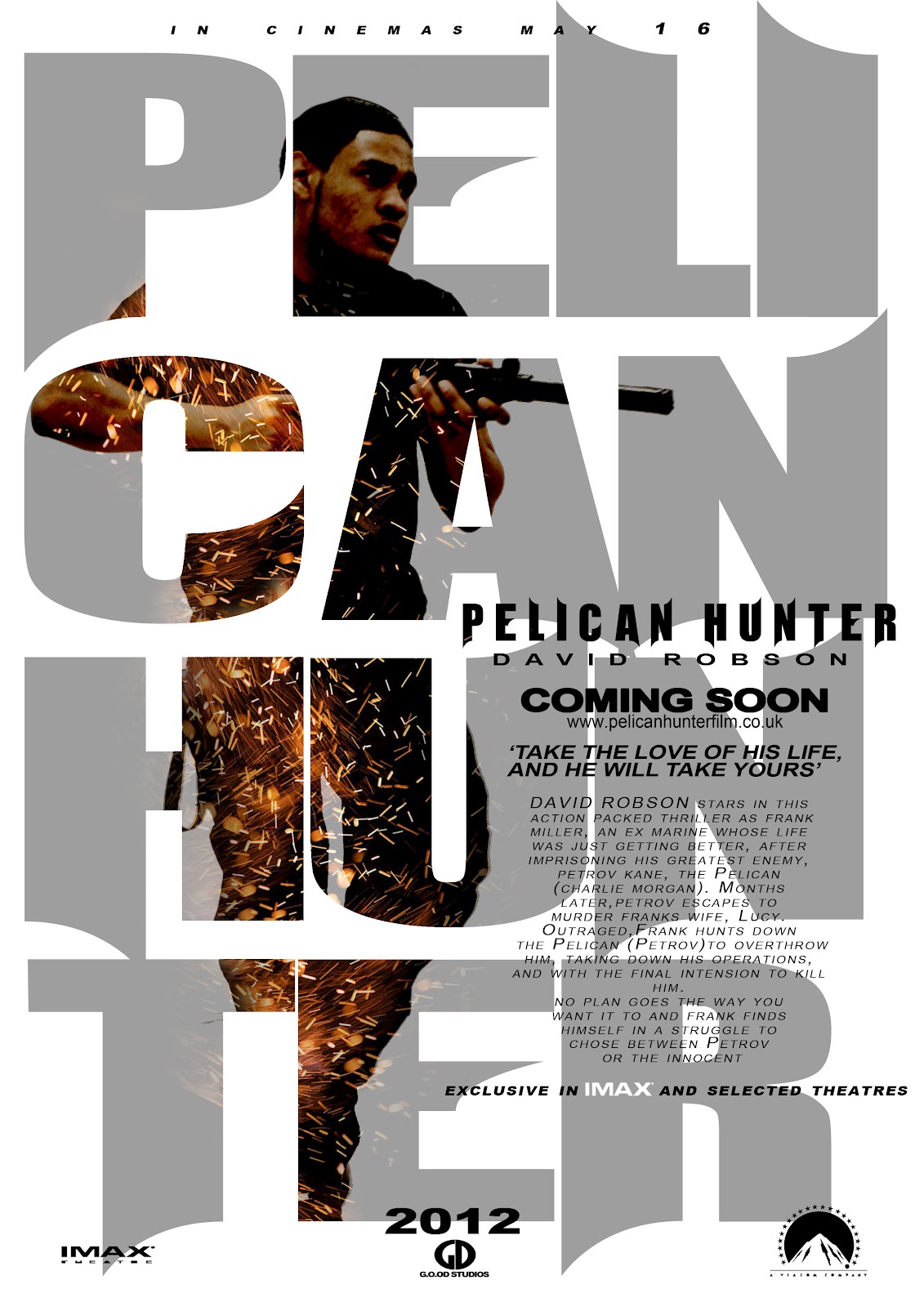
I wanted to maintain the text consistently so it linked between the different magazines and posters of my other piers of team G.O.O.D. The image we used in the poster was powerful and conventional to our genre as it has the bad vs the good guy on two separate posters, which many action movie posters do, when i researched in to real media products. The spark effect on both posters creates that gritty action feel to it and though the background is white the way we used the font on the poster made up for it and the way it was layed out was very smart. The small font with the credits also became generically conventional as you see it in all the film posters.

With the other Magazines the text was still same, as i said it had to be consistent.
The layout was different and it was a landscape so the image could fit for the shatter effect. The broken glass effect with the pelican hunter text was a smart idea and conventional to other real media products. The main task was to keep all the magazines and the posters in link with each other and i feel G.O.O.D have done so. The Pelican Hunter title was a 3D image and it links with the title in the film trailer at the end.


G.O.O.D also used all conventional motifs when producing and is shown in all all posters. We have looked into film poster and they all have the IMAX and the distributor 'Paramount, Universal, Warner Bros.' credits etc. The distribution is conventional as it is printed in all posters and on our print.
No comments:
Post a Comment